 Confex Sofas
 Sofio Poufs
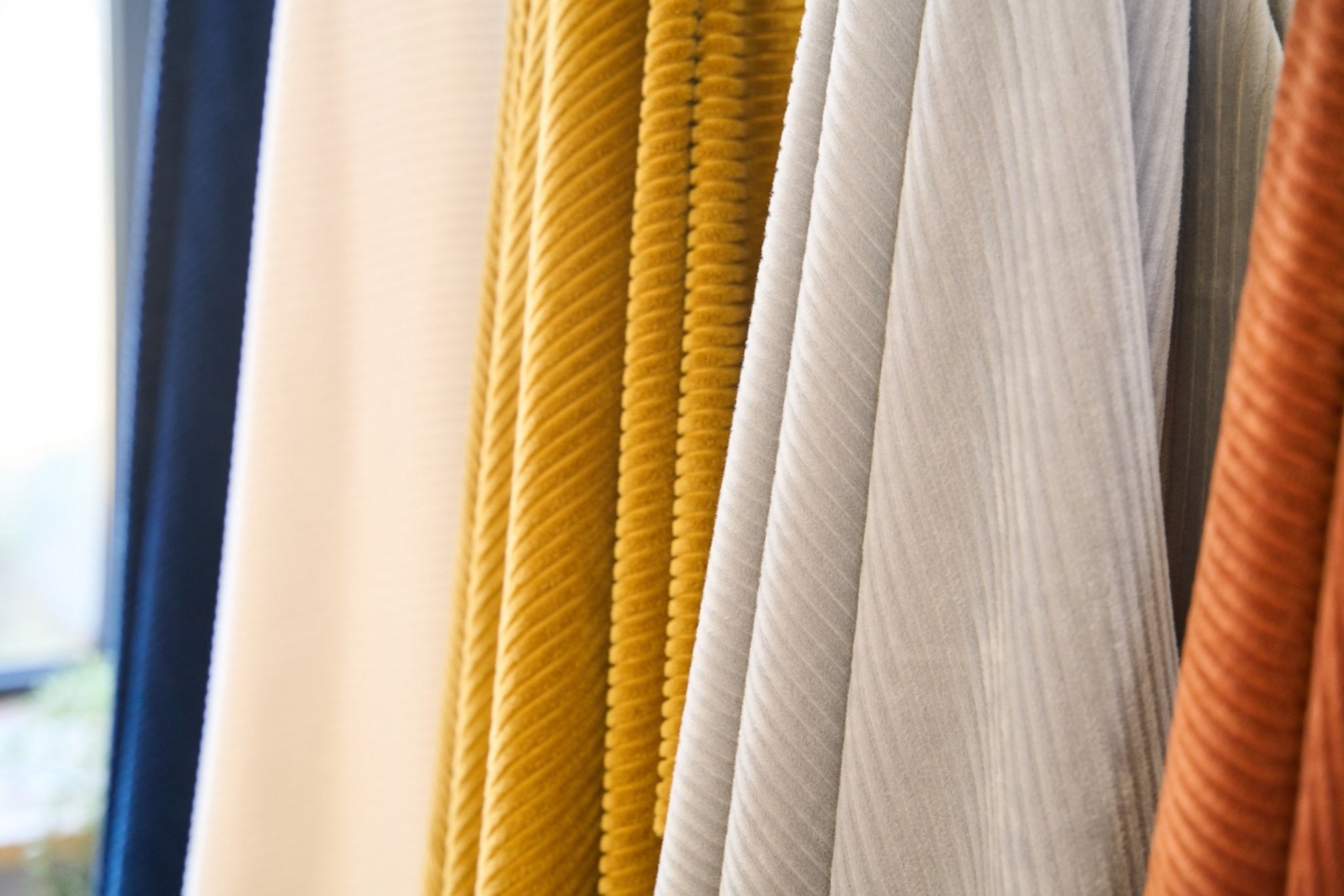
Why the 70-20-10 Rule Works in Interior Design? Learn from a furniture expert.
The rule is rooted in color psychology, visual hierarchy, and emotional balance. Dominant tones provide calm and cohesion, secondary shades introduce contrast and interest, and accents create excitement and focal points. Together, this structure ensures that the space never feels flat or chaotic.
This rule adapts across styles:
- In Scandinavian design, white or gray dominates, natural woods support, and black or brass adds contrast.
- In boho interiors, earthy walls form the base, layered textiles add depth, and vivid accessories pop.
- In modern homes, neutrals dominate, monochromes support, and metallics or vibrant primaries accent.
The Psychology Behind the Rule
This rule taps into how the human brain processes visual input. We crave predictability, rhythm, and small doses of surprise. A 70% dominant background offers comfort and visual grounding. The 20% secondary tone introduces mild stimulation and visual depth, while the 10% accent gives the room an emotional pulse a visual “exhale.”
This mirrors the Gestalt theory of perception and cognitive fluency: spaces that respect proportion feel more intuitive and calming. Rooms styled using this rule are more likely to create a sense of emotional well-being, without needing to understand the science behind it.

How to Apply the 70-20-10 Rule: Step-by-Step
Step 1: Choose Your 70% Dominant Color
Used on walls, floors, and large furniture pieces. Neutrals or muted colors are ideal.
Step 2: Add 20% Secondary Color
Mid-sized elements like rugs, curtains, and storage pieces. Slightly richer tones offer depth without overwhelming the room.
Step 3: Complete with 10% Accent Color
Bright, bold, or metallic pops,through pillows, art, vases, or lighting. The key is to use it sparingly but deliberately.

70-20-10 Color Application Table
| Color Percentage | Design Function | Used On | Tip for Selection |
|---|---|---|---|
| 70% | Visual foundation | Walls, flooring, large furniture | Stick to calm, versatile tones |
| 20% | Supporting contrast | Rugs, curtains, cabinetry | Slight contrast or support |
| 10% | Visual excitement | Cushions, art, vases, lamps | Go bold and expressive |
Real-World Examples of the 70-20-10 Rule in Rooms
-
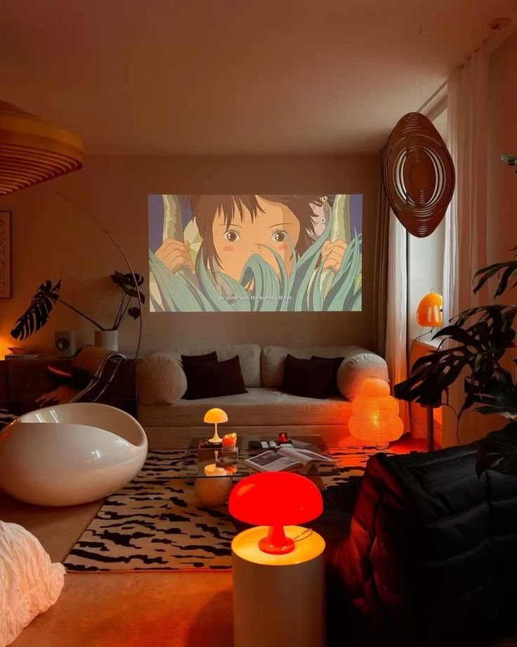
Modern Living Room: Light gray walls and white sofa (70%), charcoal rug and wood coffee table (20%), teal artwork and gold lamp bases (10%)
-
Scandinavian Bedroom: White walls and pale oak bedframe (70%), sage green textiles (20%), black metal lamps and frames (10%)
-
Eclectic Kitchen: Cream cabinets and terrazzo flooring (70%), green shelving and stools (20%), copper cookware and patterned tiles (10%)
Best Color Palettes by Interior Style
| Style | 70% – 20% – 10% Color Combo | Searchable Keywords |
|---|---|---|
| Minimalist | White – Sand – Black | minimalist home palette, neutral contrast, sleek accent |
| Scandinavian | Soft gray – Natural wood – Forest green | nordic home, muted contrast, calming tones |
| Bohemian | Beige – Terracotta – Aqua | earthy boho style, colorful accents, natural textures |
| Coastal Modern | Sky blue – White – Coral | beach house decor, relaxing color mix, summer accents |
| Urban Industrial | Concrete gray – Leather brown – Brass | loft design, industrial accent, modern contrast |
Top Benefits of the 70-20-10 Rule
- Ensures cohesive color distribution
- Simplifies styling for beginners
- Works across small and large spaces
- Enhances resale appeal with color harmony
- Makes accent colors pop without overwhelming
- Supports flexible furniture and layout changes
- Adapts to changing seasons and trends easily
Rooms That Benefit Most from the 70-20-10 Rule
- Living rooms
- Master and guest bedrooms
- Studio apartments
- Entryways and hallways
- Open-concept kitchens
- Small apartments or rentals
- Home offices and creative spaces
Avoid These Common Mistakes
- Overusing accent tones (more than 10%) can clutter the space
- Skipping the secondary tone makes the palette too flat
- Using clashing hues without checking color harmony
- Forgetting texture and finish,flat color alone can feel lifeless
- Symmetrical placement of accents asymmetry can feel more natural
Seasonal Variation with the 70-20-10 Rule
You don’t need to repaint each season,just update your 10% accent items:
- Spring → Blush, mint, lavender
- Summer → Coral, sunflower yellow, aqua
- Autumn → Rust orange, plum, ochre
- Winter → Navy, pine green, silver or gold
These subtle refreshes maintain emotional alignment and add visual novelty.
Summary: Why Every Space Needs the 70-20-10 Rule
The 70-20-10 color rule isn’t just a trend ,it’s a design framework that taps into visual psychology. It allows you to bring both structure and personality into a space, whether you're working with neutrals or bold tones. Its versatility and simplicity make it one of the most accessible and timeless design tools.
Conclusion: Design Smarter with Proportion
If you're aiming for balance, emotion, and harmony in your interiors, start with the 70-20-10 principle. It takes the guesswork out of decorating and helps you build a room that feels layered, intentional, and easy on the eye. Whether you’re creating your dream home or staging for sale, this rule works every single time.
REFERENCES
Elliott, R. (2021). The Fundamentals of Interior Design. Bloomsbury Visual Arts.
Birren, F. (2013). Color Psychology and Color Therapy: A Factual Study of the Influence of Color on Human Life. Pickle Partners Publishing.
Pile, J. F. (2007). Interior Design. Prentice Hall.


Share:
Outdated Sofa Colors in 2026: What to Avoid and What to Choose Instead
Are Multifunctional Sofas Really Worth It? A Furniture Expert Explains With Research Based Evidence